Billing details
Issue
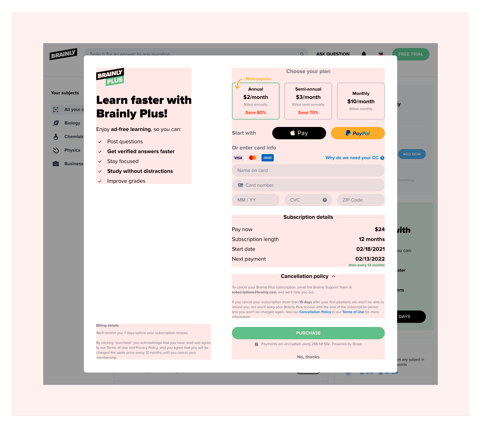
People don't read Billing details.
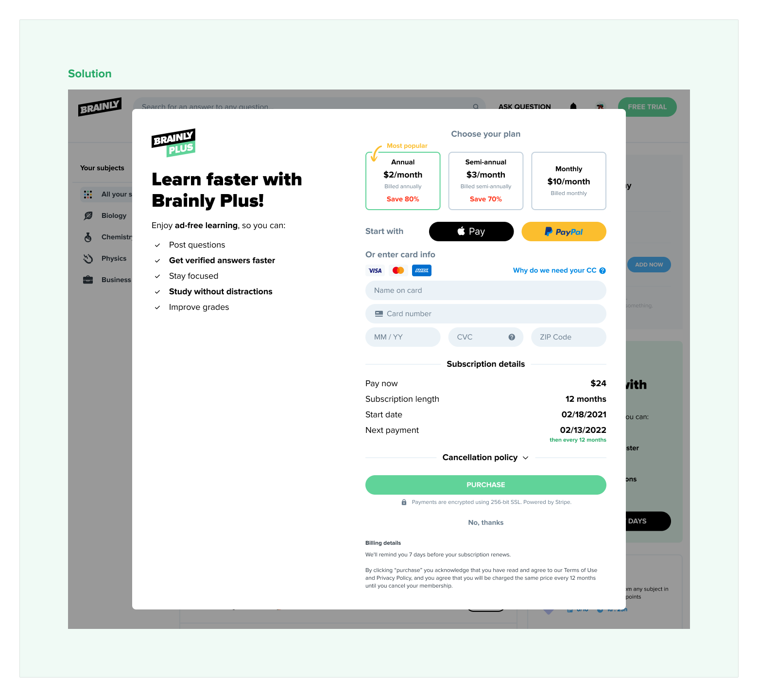
Advertisement and information about what is included in the Brainly Plus on the desktop model are on the left section. The next important piece of information is in the right section. Position of the Billing details are on the bottom of the left section. This might be the reason why people miss it, as they are focused on the plan and payment informations. So positioning it on the same level as the Purchase button make it even less important. The other thing is that the color of this text is very light.
Solution
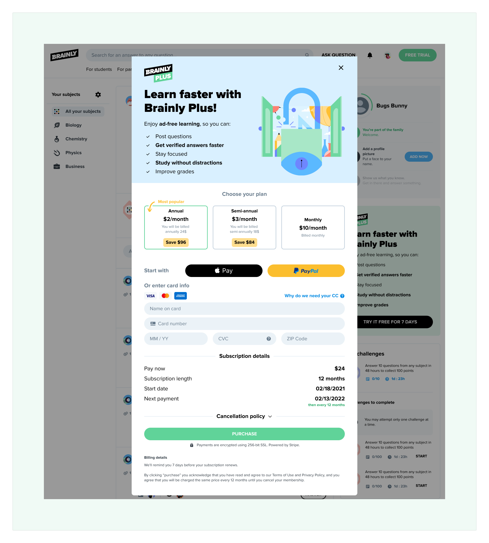
Change position of the Billing details.
Changing the position near the Purchase button might solve the issue. Also, the text color might be darker, making it easier to read.
Full size images:
Issue 1
Solution 1
Plan details
Issue
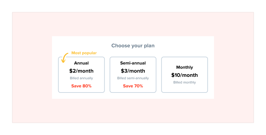
Misinterpretation of the payment of Annual subscription plan.
All plan boxes represent the plan's monthly cost, but for the Annual and Semi-annual, it’s not the final amount that the user will pay instantly after purchase.
Solution
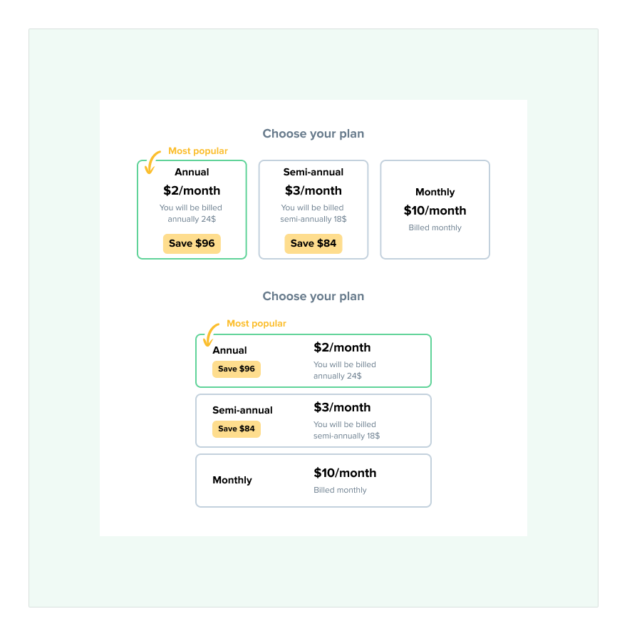
Add the total cost to the plan boxes.
Adding the total cost to the “Billed” line might help understand how much plans cost in total. Maybe changing % from the “Save” part for a proper value of $ is a good idea, as not everybody is good at math, and it can visualize the amount of savings even better.
Full size images:
Issue 2
Solution 2
"No thanks" button
Issue
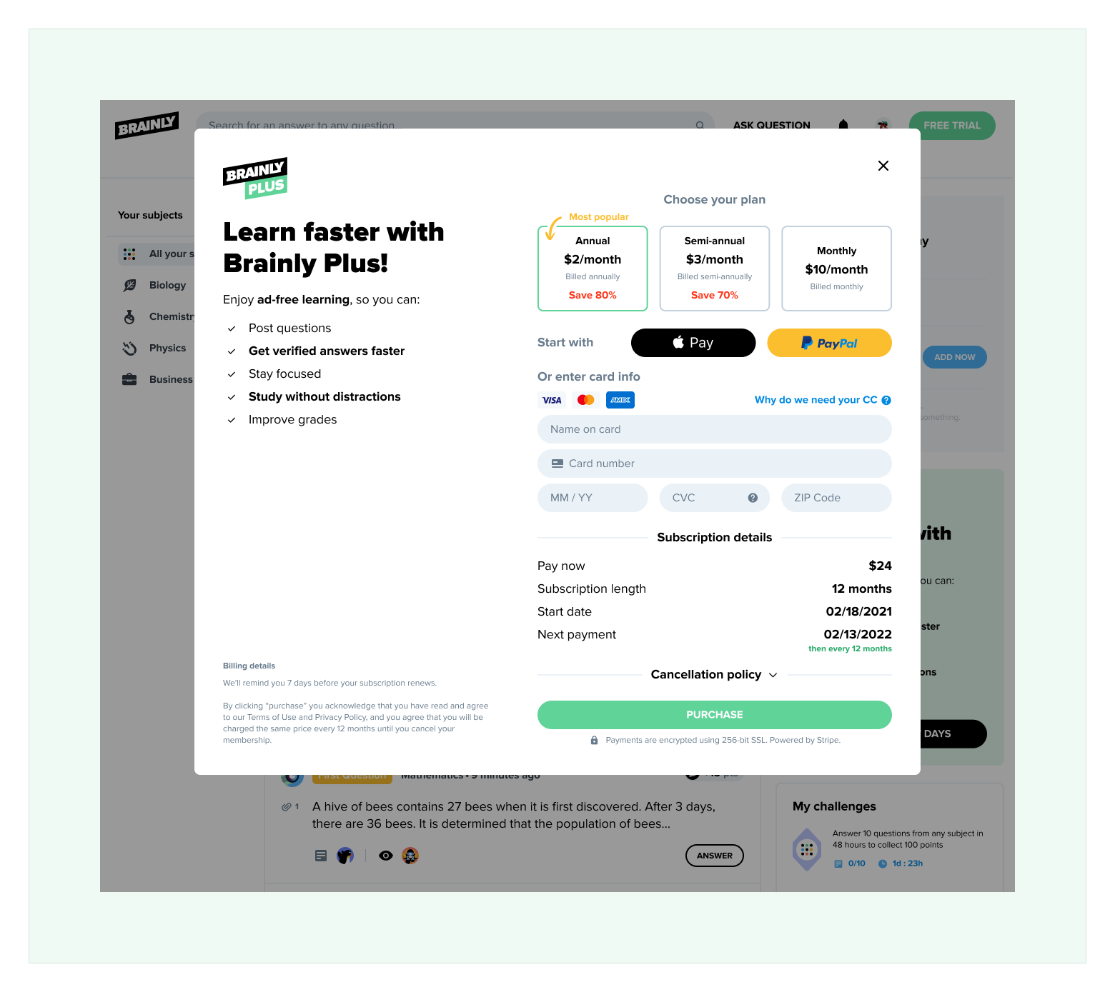
“No, thanks button” close to “Purchase” button.
After going through the whole purchase journey, the user has to click the Purchase button to finish it. The position of the “No, thanks” button might cause him to rethink his idea about buying the selected plan.
Solution
Change position of the “No, thanks” button.
As this i modal box, more intuitive would be add it to the top right corner as it is very common pattern used almost in every place. Maybe in that case it could be replaced by simple “X” button.
Full size images:
Issue 3
Solution 3

Overall design of the form
Issue
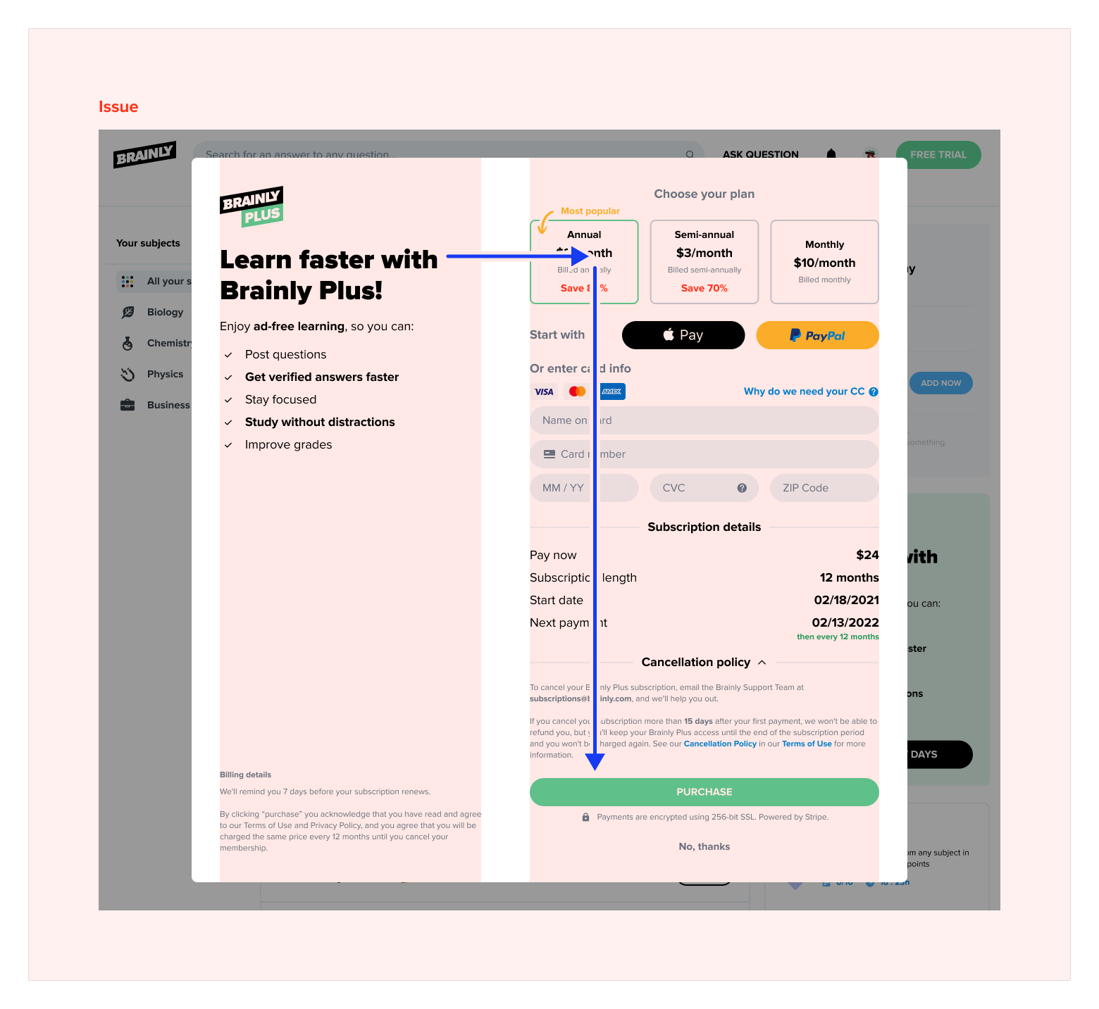
Subscription screen is very busy.
At first glance, there are many different sections spread around the whole screen, which fight for the user's attention. Also, the "Choose your plan" and "Start with" areas look like they are one extensive section.
Solution 1
Rearange the modal informations.
Changing composition so everything is in one column like in the mobile version.
Solution 2
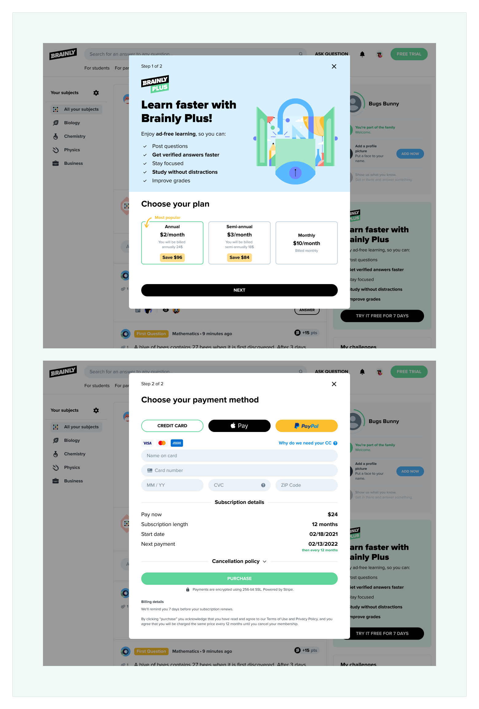
Create separate steps for plan and payment.
To increase focus on the plan and payment method, we can introduce 2 step process. On the first screen, the user can choose the plan, and on the second one, he can finalize the purchase. The billing option can be a bit simplified on the payment screen, so next to Apple pay and PayPal, we can introduce the Credit Card button, which is selected by default.
Full size images:
Issue 4
Solution 4a
Solution 4b
