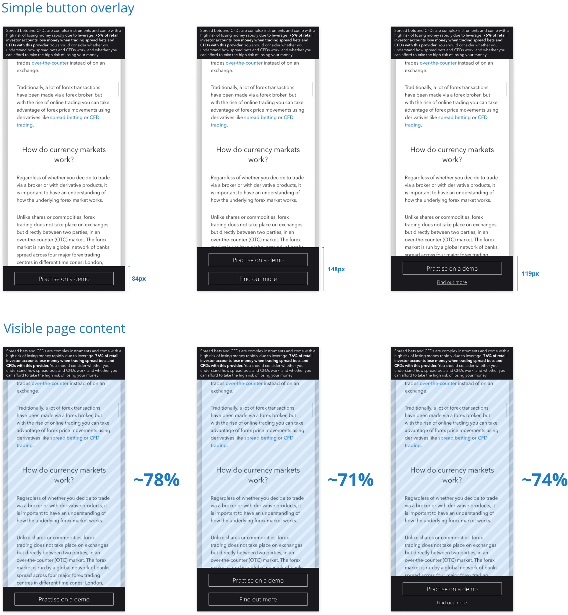
Simple button overlay
The first version is the simplest one. The bottom CTA is visible all the time on the screen which is beneficial for the company as it advertises its product. But it might be very annoying for the user as it consumes screen space. Also, a negative effect might be miss clicking on the CTA, by the user if they don't want that.
Full size image:
Option 1

Option: close permanently
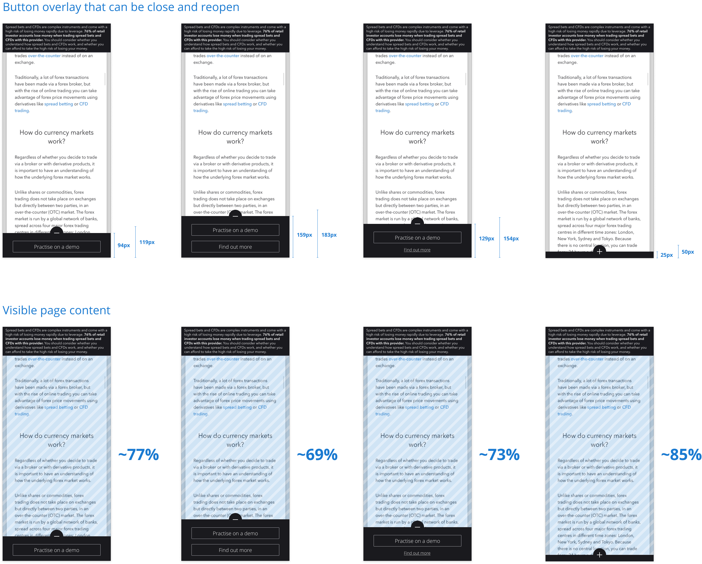
The second option gives the user the opportunity of closing the bottom CTA permanently. It's less beneficial than the first option for the company as the user can close important CTA forever. For the user is more beneficial if he wants more screen clarity, but, also it might be a bad option if at some point he would like to reopen the bottom panel and use one of the CTA's.
Full size image:
Option 2

Option: with toggle
The third option gives the option to toggle the bottom panel. It's a compromise between the first and second options. It consumes more screen area than the first option, but after hiding it, we recover lots of space, and also we give the possibility of reopening it at any time to the users.
Full size image:
Option 3
